Lucky DiaryWeb Application /
2012
Concept & Brand
An online journal with a unique visual identity that offers a simple, intuitive layout.
Live: www.luckydiary.com
Why I created Lucky Diary
In 2012 there weren't many online diaries/journals. And the few that were available I felt were lacking in aesthetics and usability. Unnecessary features and clunky user flows were making journaling complicated. I was inspired to create a journal with a bold design that was simple and easy to use.
Context
I'd spent a decade as a visual designer within teams where strategy, wireframes, and visual design, were handled by different people. I yearned to approach the design process holistically and dive into creating a full product on my own. I wanted to do it all - from concept to UX and UI to code. This was the perfect opportunity.
Design Decisions
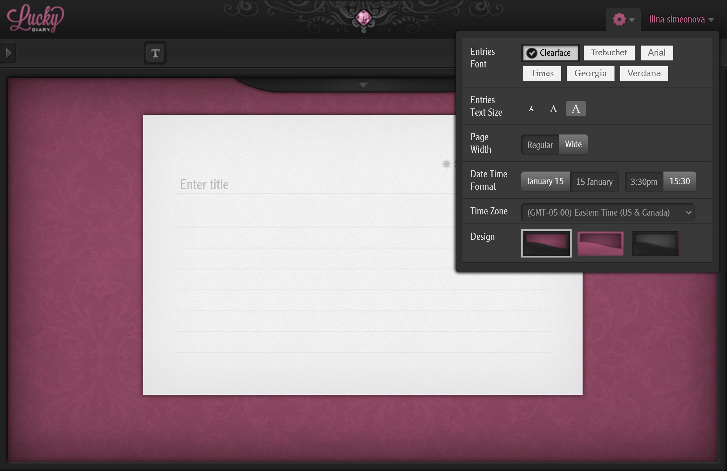
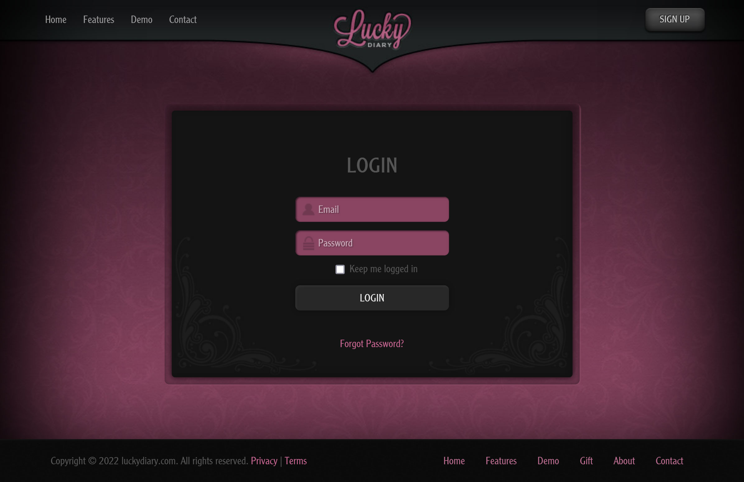
Functionality: I aimed for functionality that mimics the ease of a real-world journal. I wanted to preserve its simplicity and add only features that would make a physical journal easier to use - nothing extra. To give the user a sense of ease and control I designed it as a one-page app, which was a new technique in 2012.
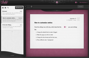
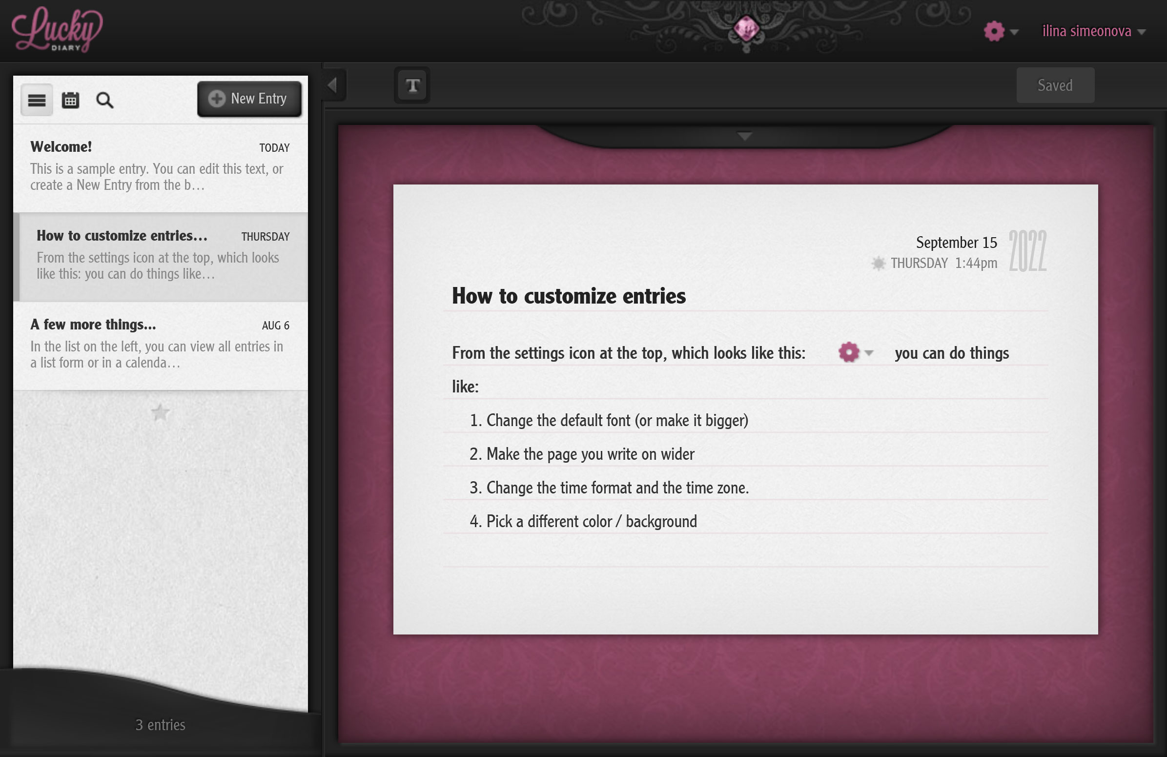
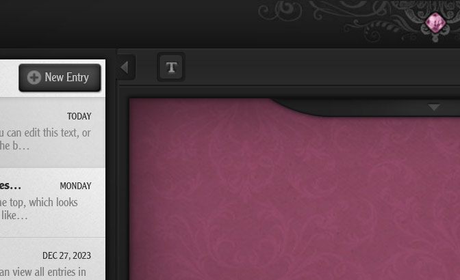
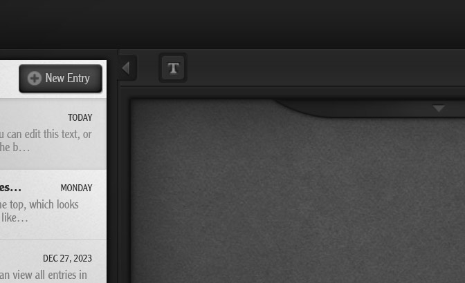
Easy to grasp: To attain simplicity, I prioritized visual hierarchy. The focal point is the journal entry, while the "New Entry" button stands out as a secondary action. The sidebar is the second area that draws attention and serves as navigation - either via a calendar or via entry history. Entry options are subtly tucked above each entry, to be noticed only when needed.
Auto-saving: I strived to reduce clicks and shorten steps as much as possible, so I designed the entries to be auto-saved. But that was a pretty new functionality for 2012 and I felt the users may feel uneasy about losing their entry inadvertantly. So, for the user's peace of mind, I added a "Save" button as well as Ctrl+S shortcut with visual feedback.
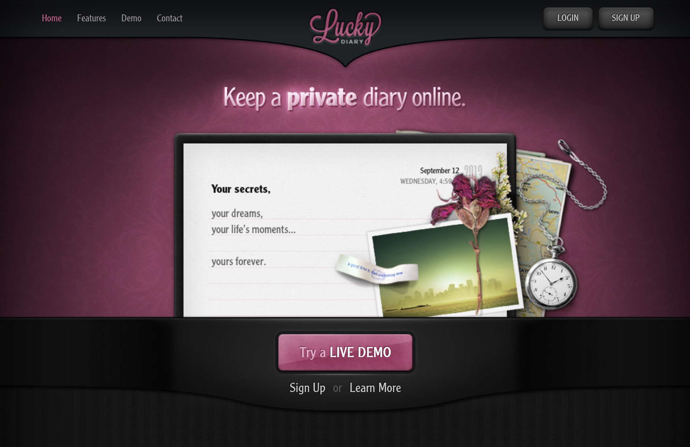
Identity: To position this product within a market of very generic-looking journal apps that aim to appeal to everyone, I aimed for a bold theme here. I went for a more dramatic and cinematic feel - perhaps a bit feminine. I wanted it to feel personal & private, a bit emotive and nostalgic. Perhaps a bit reminiscent of the secret diary of a young girl with a lot on her mind.
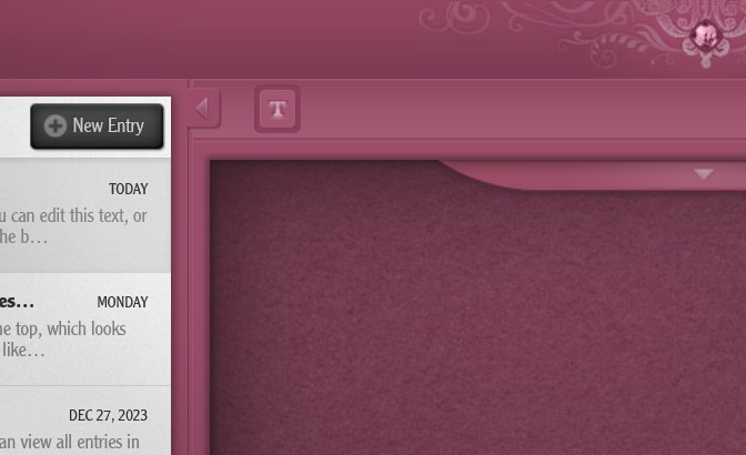
Look and feel / Visual Style: Тo create a "secret and private" feel, I used deep colors, shadows, and a dark color scheme. Тo add am emotive element, I went for a strong tactile feel, particularly in the theme variations. I used comforting textures one might normally experience while using a high-end physical journal, such as paper, smooth leather, suede, and fleece. And to create that girly, yet nostalgic feel, I used a deep subdued magenta color, and added that *magical* decorative gemstone at the top of the page (in the Main and the Pink themes). Like a lucky charm :-) I included two variations of the main theme:
Main Theme
Pink Variation
Dark Variation
New User Guidance: I aimed to minimize the need for intros and guides by creating a design that's as intuitive as possible, and pre-filling several entries to serve both as example and guidance.
Personal Design Principles: In product design, I always aim to create a sense of location and control - making it intuitively clear at any given moment where in the app the user is, and what they can do next. Additionally, too many web experiences attempt to achieve simplicity by obscuring basic information - which can make a user feel lost and unaware of the available options. Instead, I opt for creating an intuitive hierarchy - visual and experiential. Another way I try to give the user a seamless experience is that I try to avoid popups that cover the whole screen and large unexpected elements - they disrupt the attention path. Disrupting a user's process to grab attention has its place, but it comes at a cognitive price and should be used judiciously. I always strive to be gentle to the user's cognitive load.
Highlights (some fun features)
Bookmarking: Important entries that the user expects to refer to often can be bookmarked, so that later can be more easily found via the search / filtering feature.
Writing Prompts: I created 365 writing prompts - a new one each day - that have a positive vibe and give ideas for journaling.
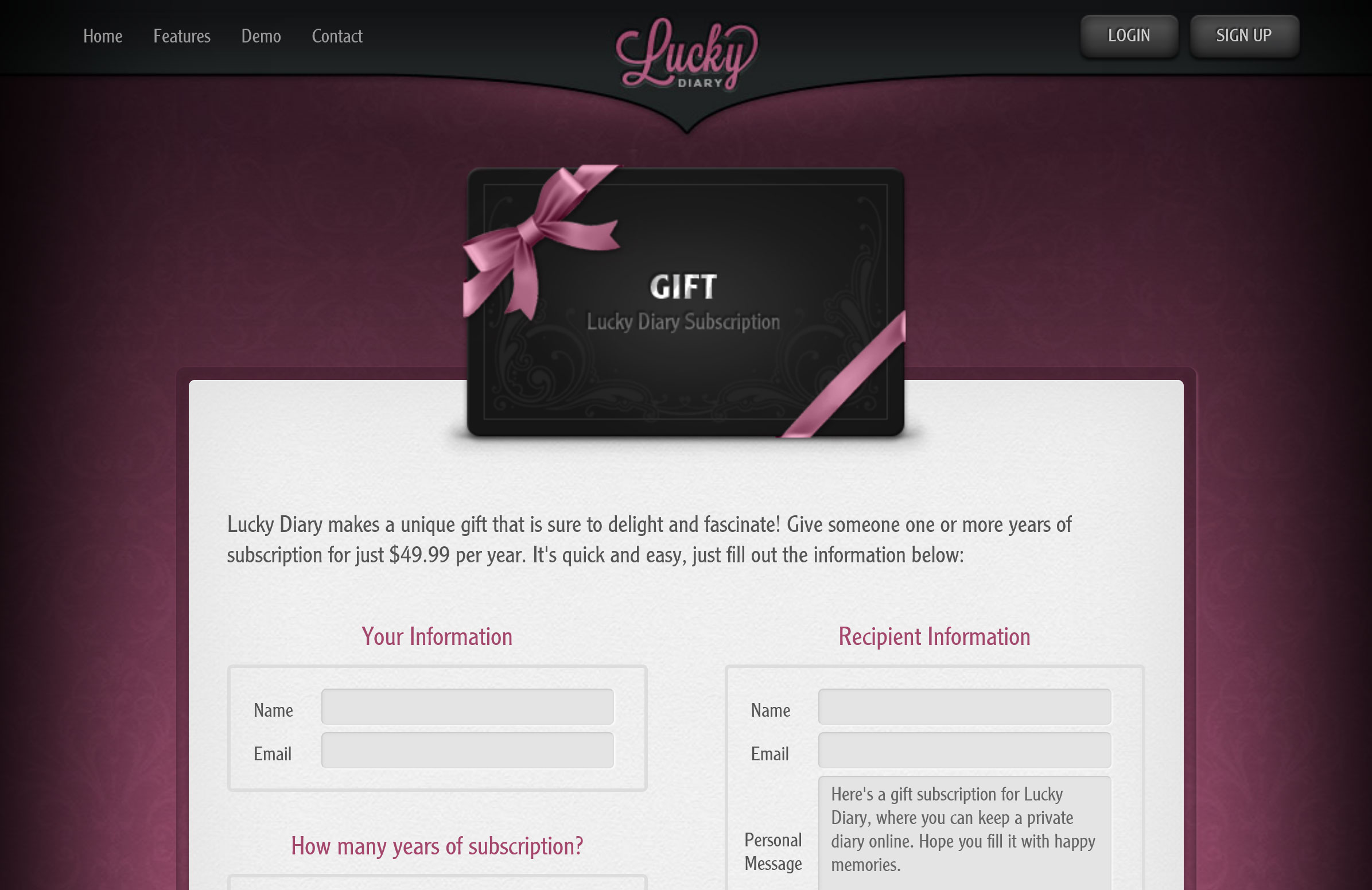
Sharing: While the app is private, individual entries can be instantly shared via a private link (which can easily be reverted at any time).
What I'd Improve Now
Visual Design
Design trends, techniques, and technologies have evolved since 2012, and a lot more is possible via CSS now. I would modernize the homepage, visuals, and code.
Interactivity
There are exciting new capabilities now for making UIs more interactive. While I would keep the layout, I'd add more interactivity and micro-animations.
Try a Demo: www.luckydiary.com