plan.coffeeWeb Application /
2014-2015
Concept & Brand
An online calendar that keeps your daily schedule aligned with your life goals and priorities.
Demo Account: www.plan.coffee
Why I created plan.coffee
Calendars and to-do lists help us keep track of what we need to do, but they don't keep the larger picture of our life in sight. Most online calendars don't even integrate a task list, and task apps don't help us prioritize. With plan.coffee I aimed to design the ultimate life management system, while also promoting life balance and introducing some unique features.
Context
I'd already created a couple of simpler apps, and now I was ready for a more complex one. I was aiming to develop an MVP and test it in real life. While the product never launched to market, I learned a lot through the experience of being involved in every aspect - from concept and structure to design / front-end coding and collaboration with a back-end developer.
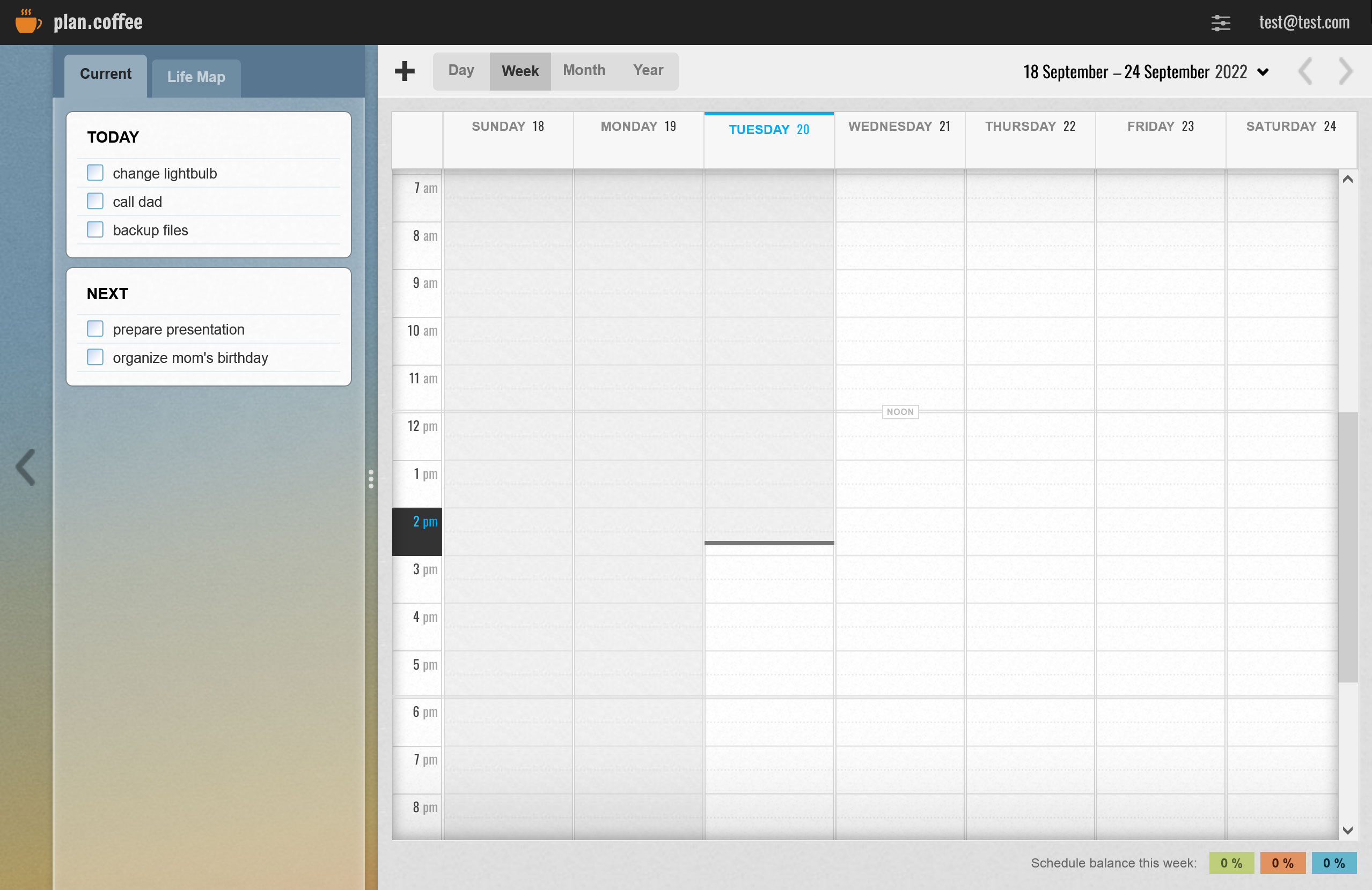
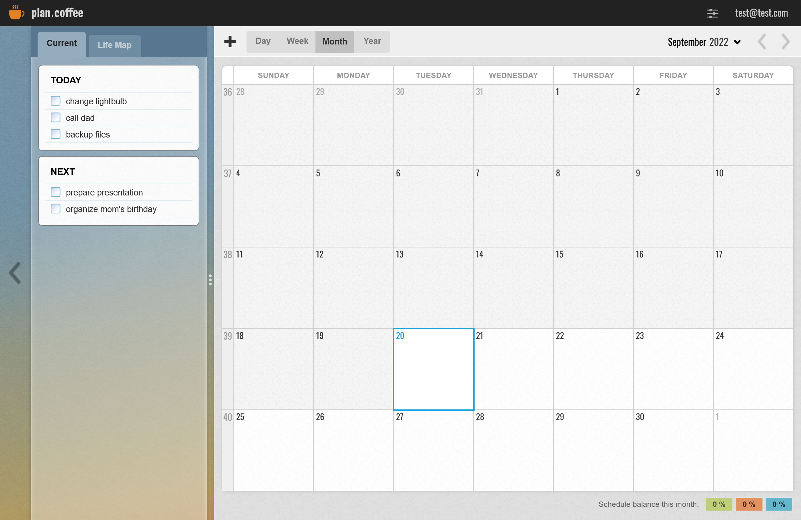
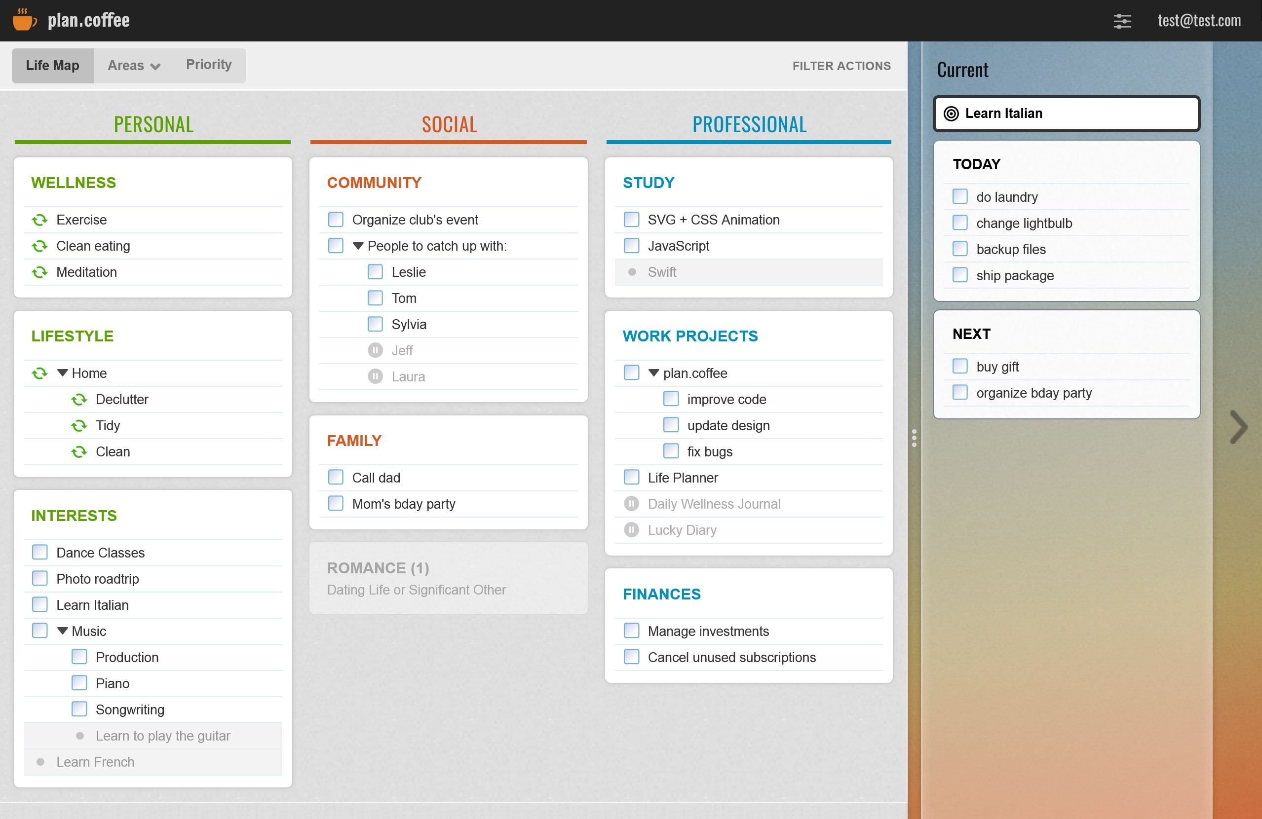
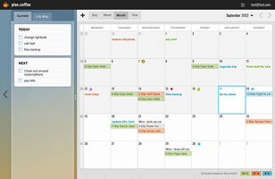
Layout Concept
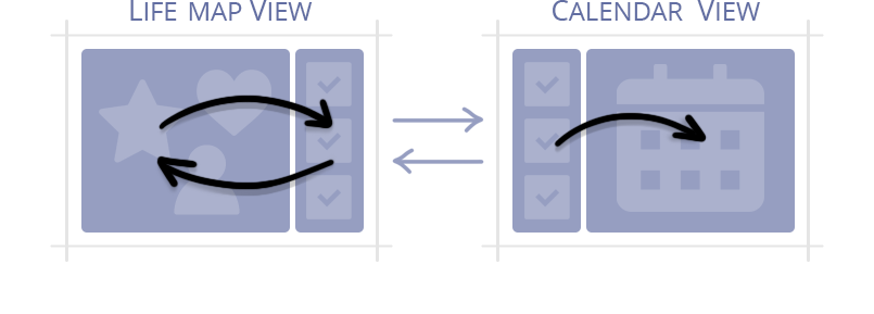
Drag and drop action items between the two main views - the Calendar (day-to-day scheduling) and the LifeMap (big-picture planning). The two views share the "Current Tasks" list - the user can keep it in sight whether they're planning their day or their life.
Design Priorities
Ease: Making something as complex as "life" feel simple is no easy task! Therefore, I wanted to create an experience that builds on top of familiar concepts, so it feels logical and useful, while its more intricate functionality can be discovered over time.
Sense of Location: More than anything, I aimed to create a sense of space and keep the user from feeling lost within the app. I wanted all features to feel available at all times, with no jarring popups covering the view; good hierarchy, clear action labels, and subtle visual cues.
Highlights (some fun features)
What I'd Improve Now
Visual Design
Design trends, techniques, and technologies have evolved since 2015. I would modernize the design and the code, and remove some visual cues that are no longer necessary in modern design (because of evolving conventions). I'd make some features smarter and create clearer hierarchical distinctions.
Interactivity
I would rework the layout to make it more flexible for feature expansion, and more intuitive. I'd also make the UI more interactive while using more modern cues for certain features. I'd add more interactivity and micro-animations.
Demo Account: www.plan.coffee