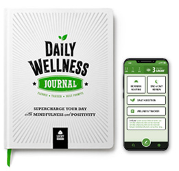
Daily Wellness JournalPrint Product + Mobile App
/
2018, 2022
Concept & Brand
Print Product
In 2018, I created the Daily Wellness Journal - a diary/planner that promotes mindfulness and positivity. It guides you through routines that improve well-being & self-awareness and prompt reflection.
On Sale: Amazon.com
Mobile App
In 2022, I created a mobile app version of the paper product. I aimed for an experience that's visually consistent with the paper version, yet utilizes the distinct capabilities of the mobile platform.
Adobe XD Mockup:  Watch Video
Why I created the Daily Wellness Journal
Many people have heard of the amazing benefits of journaling and are motivated to try it, but don't know where to start. That's where a guided journal comes in. While there are many options on the market, I felt most were lacking in features or aesthetics. I created the Daily Wellness Journal with a focus on aesthetics while utilizing techniques that improve well-being, self-awareness, and positivity.
Context
I'd already been publishing the LUCKY Life Planner for 3 years and now had a firm grasp of the printing process - from design to manufacturing. I was excited to create a new product that was complementary to the LUCKY Life Planner, yet had a distinct visual identity.
Product #1: Printed Journal
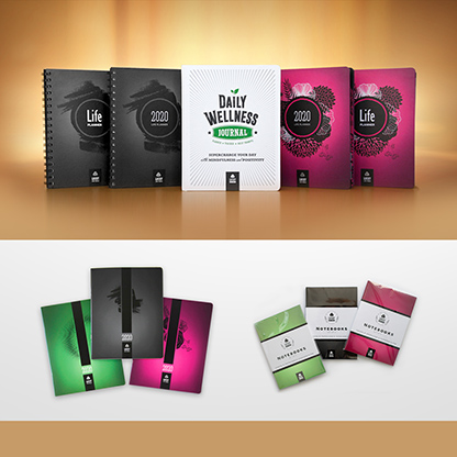 Identity: As a part of the LUCKY Life Tools brand, the journal belongs to a series of products (Life Planners, Monthly Planners, Notebooks). To give all products a consistent look I designed their covers with a central focal point slightly above the middle, added a logo in a black rectangle at the bottom, and kept a consistent color scheme.
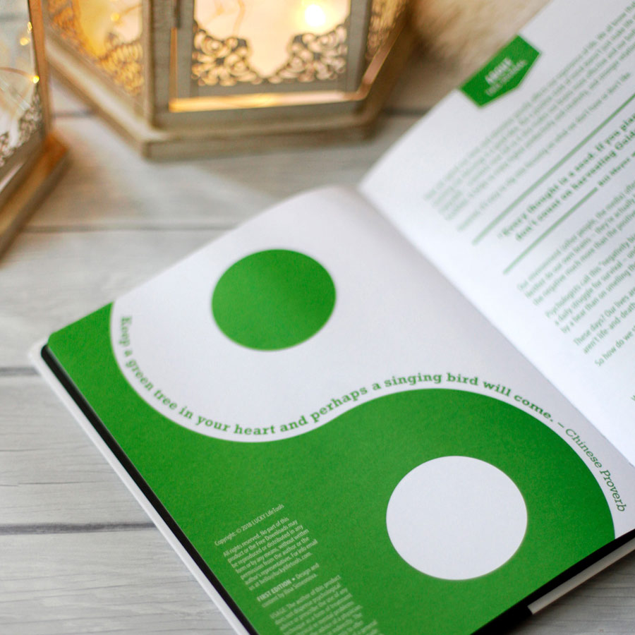
 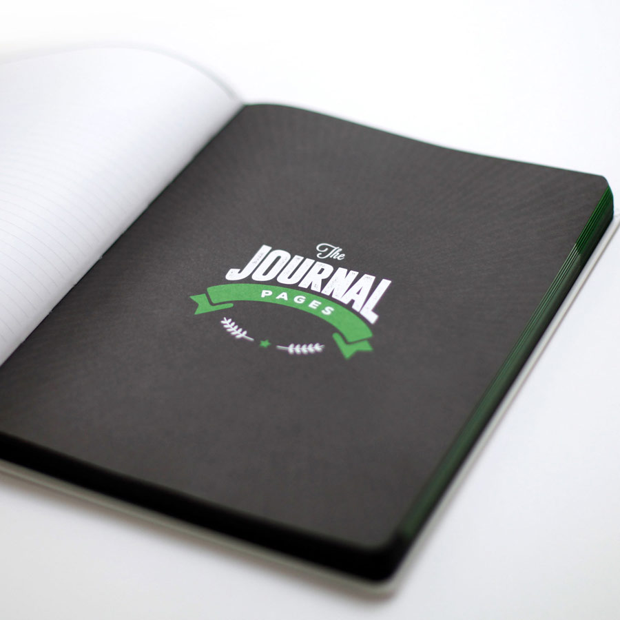 Look & Feel: To give the Daily Wellness Journal a distinct identity, I designed the cover to be light-toned, and the interior in color. The theme being "wellness", I chose the accent color of lively green, a color commonly associated with health. To give it extra vibrancy and a sense of cleanliness and positivity, I complemented it with a high-contrast mix of whites, blacks, and greys - and utilized subtle sunburst elements.
 Construction: This being a hard-cover journal, it was important to choose binding that allowed it to lay flat, So I chose Smythsown stitching, combined with bright white 100gsm paper. I chose thin water-resistant hardcovers and rounded corners so it's lightweight but wears well over time. To add style I requested black edges, black endpages (the inside of the covers), and a green satin bookmark ribbon.
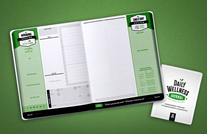
  The Anatomy of Writing: I've noticed people often write with their journal on their lap or while lying on their bed, rather than when sitting at a desk. In those cases, the hand rests on the journal itself, so it may get tired when writing close to the edges. So I kept most of the denser writing areas at the top and middle of the spread while leaving the bottom and side areas for lighter note-taking.
 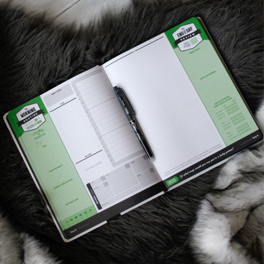 A Day at a Glance: This being a daily journal, I wanted each day to take up one spread, to make it feel manageable. I felt the logical flow from morning to evening would be from left to right. I color-coded the time-specific routines such as Morning and Evening in green, while 'anytime' areas like tasks, schedule, wellness tracker and journaling, are in white and grey.
I felt this creates a visual representation of a beginning, middle, and ending of a day, and instills a sense of completion.
A Day at a Glance: This being a daily journal, I wanted each day to take up one spread, to make it feel manageable. I felt the logical flow from morning to evening would be from left to right. I color-coded the time-specific routines such as Morning and Evening in green, while 'anytime' areas like tasks, schedule, wellness tracker and journaling, are in white and grey.
I felt this creates a visual representation of a beginning, middle, and ending of a day, and instills a sense of completion. 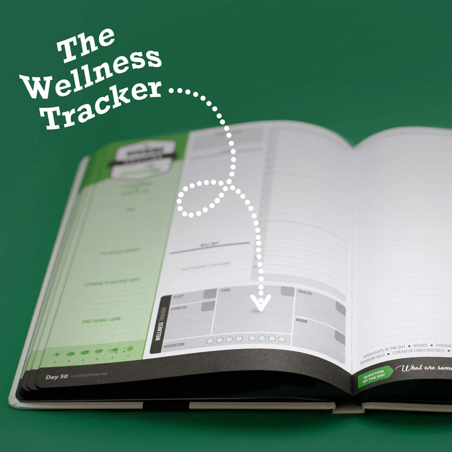 The Wellness Tracker: This is a cool feature that helps you track various things about your day - nutrition, hydration, mood, health, sleep, etc. In addition, the journal comes with external worksheets that help you analyze the results and find correlations. For example, you might discover a certain health issue appears concurrently with eating certain foods, or certain weather.
  The Daily Question: There is free space for free-form journaling, but just in case one needs extra ideas, on each spread there is a unique question that helps the user increase self-awareness, positivity, and a sense of well-being.
 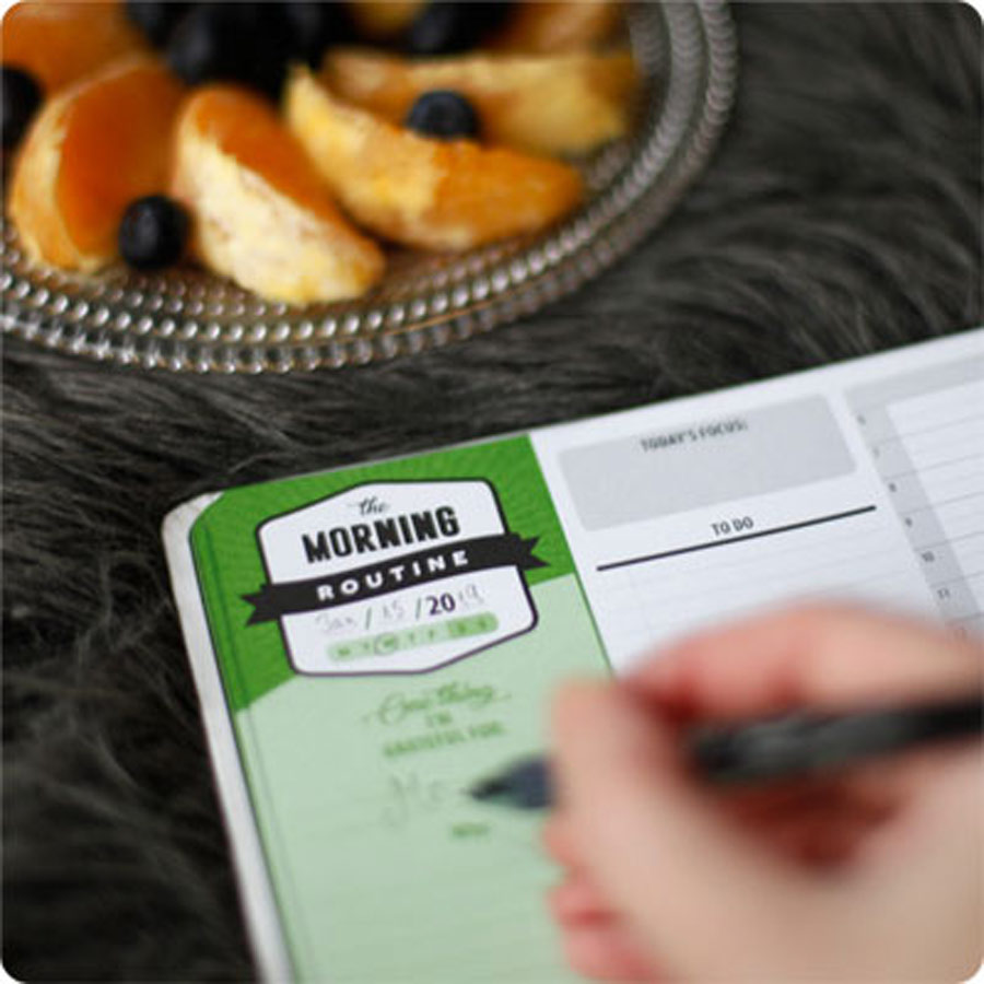 Convenience: I made sure the date is in the top left corner so users can easily page back to a specific day. I also added a day count at the bottom of each spread in both far corners (left and right).
 Product #2: Converting it into a Mobile App
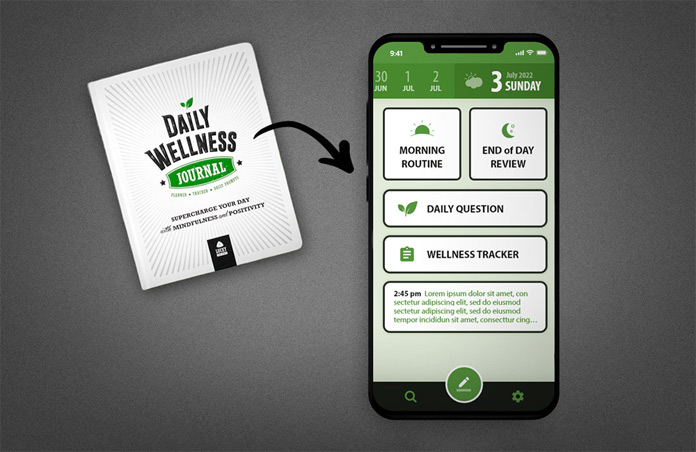
App Identity: Needless to say, designing for mobile is very different from designing a print product. I had to consider the completely different way users would interact with the product, the new viewable size, and the unique challenges of the new platform. I wanted both versions to feel like the same product, but I couldn't be too literal, and I couldn't use the exact same elements.
Adjusting the Logic: I still wanted to preserve the sense of "one day at a glance", but now I had a much smaller real estate to work with. So I put the journal writing areas behind buttons. In order to create easy recognition between the different sections I varied the shapes of the buttons. This layout also helped suggest that the areas don't absolutely need to be filled out sequentially.
Icons: In order to create visual recognition and add interest I introduced icons to the buttons. Icons would have added visual noise to the print product, but they give a visual identity to a button. Coupled with the spatial location, they help create a more instant and intuitive differentiation between the sections.
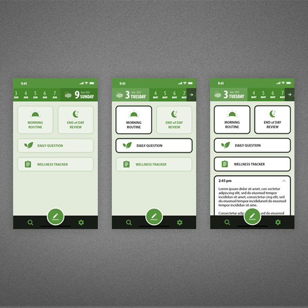
States: On a paper spread the user can see at a glance which areas are filled out and which aren't.. But on mobile, where the writing areas are accessible via buttons, I needed to add visual cues to communicate their state (since the user would presumably return multiple times per day to update the app). So I created different designs for the "empty" and the "filled out" versions of the buttons.
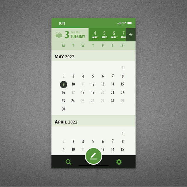 Paging Through: Instead of pages, the journal now can be browsed via a calendar. As a shorthand, I also added a mini horizontally-swipable calendar at the top, to give instant access to prior dates - just as easy as paging through a physical journal.
Adobe XD Mockup: Watch Video